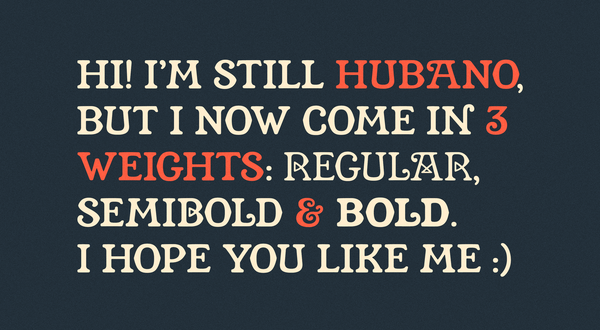
An Update for Hubano Now available, Hubano 2.0! I added two more weights, some additional glyphs and symbols—plus many fixes and tweaks. I'm excited that this one has a lot more versatility now that just the single, thin weight it launched with. Hubano is an all-caps display serif inspired
Hubano 2 Pre-Release I've taken some time to revisit Hubano, my display serif inspired by some lettering found on a Cuban cigar box. Initially, it was a single weight that matched the lettering, but it was rather thin. Great for some situations, but limited! I've added two additional, thicker
Introducing Kyroh Greetings Simple Friends, Today I'm excited to officially release my latest typeface, Kyroh. It's available for sale in the shop, and has also been distributed to all Secret Club members. Kyroh is an all-caps, sans-serif display font inspired by a vintage luggage label from
For Secret Club Members Kyroh Pre-Release Today, I'm excited to share the pre-release of Kyroh (my latest typeface) with Secret Club members. ✨Secret Club members get all SimpleBits® fonts including pre-releases plus additional perks. Kyroh is an all-caps, sans-serif display font inspired by a vintage luggage label from the National
Introducing Beeswacks Hello, Simple Friends. Today, we're announcing the official release of our latest typeface, Beeswacks! Beeswacks is a vintage-esque, display sans-serif based on a handful of letters found on an old box of candles made by Columbia Wax Works in Ozone Park, New York. Like a lot
For Secret Club Members Beeswacks Pre-Release Today, I'm excited to share the pre-release of Beeswacks (our latest typeface) with Secret Club members. ✨Secret Club members get all of our fonts including pre-releases plus additional perks. Beeswacks is a sans-serif display font inspired by some vintage lettering found on a wax candle
Introducing Clauthbound Hello, folks! Today I'm pleased to release our 17th typeface and the first of 2026. It's one steeped in literary tradition combined with my penchant for slightly analog, warbling letterforms. Clauthbound is a gently-stressed, display sans inspired by the foil-stamped, cloth book covers from
For Secret Club Members Clauthbound Pre-Release Today, I'm very excited to finally share the pre-release of Clauthbound (our latest typeface) with Secret Club members. ✨Secret Club members get all of our fonts including pre-releases plus additional perks. Clauthbound is a gently-stressed display sans in all-caps. I was inspired by dusty
Introducing Turbeau Today, our latest typeface, Turbeau, is released! It's inspired by the end credits of Knight Rider and analog synth controls. Years ago, I remember flipping through cable channels and nostalgically catching the end of an episode of Knight Rider. I loved this show as a kid growing up
For Secret Club Members Turbeau Pre-Release Today, I'm excited to share a free pre-release version of our latest typeface, Turbeau, with Gold members. Years (decades?) ago, I remember seeing the end credits on one of my favorite shows from the 1980s, Knight Rider, and was immediately struck by the typeface. More recently, I
Introducing Scorekard Our latest typeface, Scorekard, is released today! It's an imperfect sans-serif inspired by the lettering on a vintage, paper, baseball scoring card. About a year ago, I left a comment on dailydennison's photo of an old "Base Ball Scorer" photo they posted. “This
For Secret Club Members Scorekard Pre-Release I'm excited to share a free, pre-release version of our latest typeface, Scorekard, for Gold members. It started as an all-caps, imperfect sans inspired by some lettering found on a vintage, paper baseball scoring device. But as I dug into it more, expanding the source into
Paint Factory Our latest typeface, Paint Factory, is inspired by an old marine paint company building that sits on Gloucester Harbor here on the North Shore of Massachusetts. I'll often make the short trip to G-Lo from Salem in my trusty Boston Whaler, and the building's giant
Wilco Loft Sans When I was 19 or 20, my favorite band was Uncle Tupleo. I remember shaking Jeff Tweedy's hand before a show at Club Babyhead in Providence, Rhode Island some 30 years ago. I'm sure I thanked him for the music and the inspriration. I went on
Free Lunch I think the first letter I drew for Free Lunch was the C. I wanted one that had a “tight bite” (clearly an actual typographic term). Like it’s really chomping down on itself. I love the attitude it projects. I guess I love chompy Cs. From that initial C,
Grandsans I have been a lifelong Red Sox fan, and Fenway Park has always been a special place for me and my family going back generations. We’re even season ticket holders as of last year. The type around the historic park has always been inspirational. Thick, cream-colored, painted letters
Simple Type Co. At the beginning of the pandemic, I decided to channel my existential anxiety into a long-standing goal of designing a typeface. It would actually be a second attempt, as back in 2007 I'd hacked together a pixel font based on little 16×16 icons. That one doesn&



 For Secret Club Members


