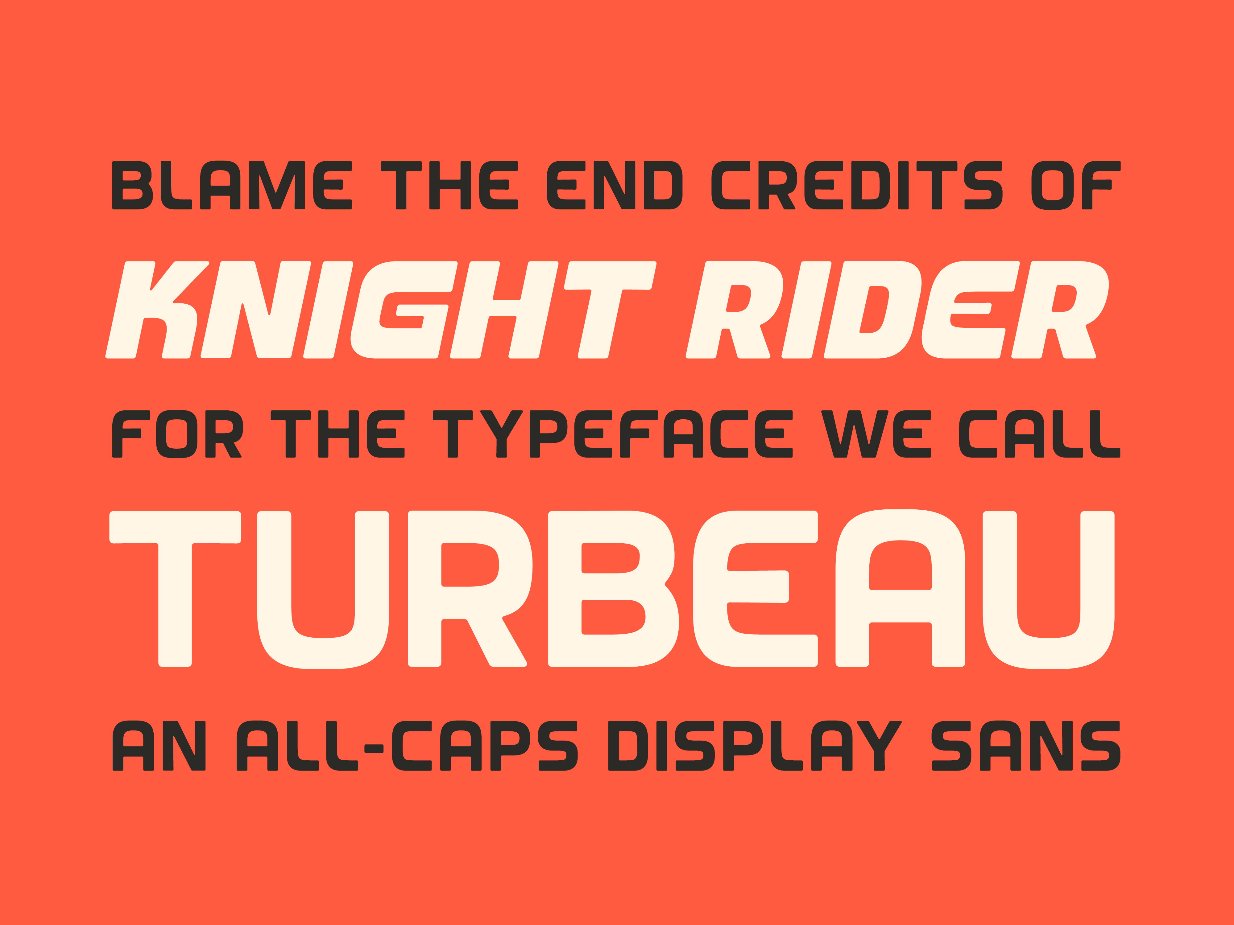
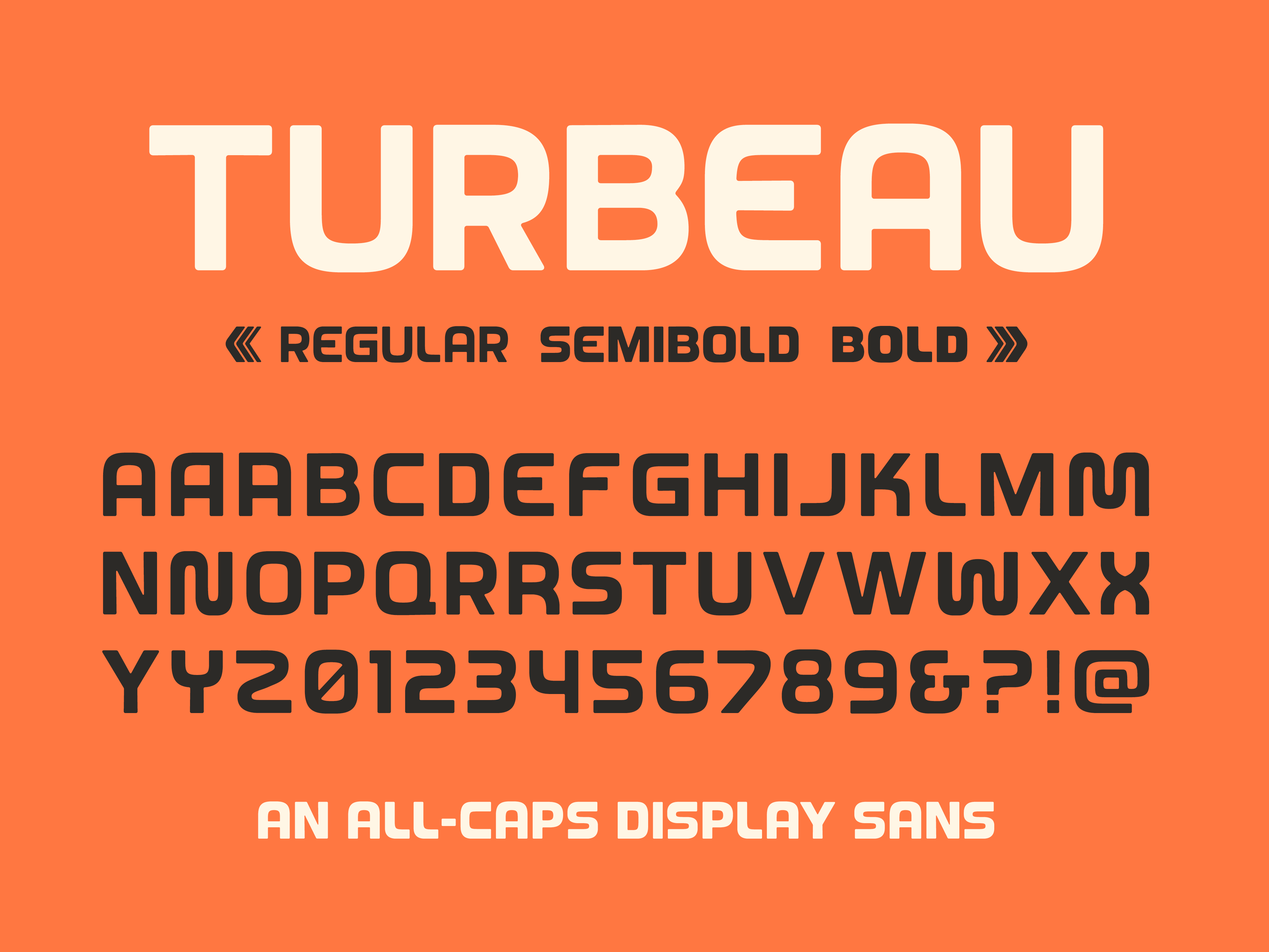
Introducing Turbeau
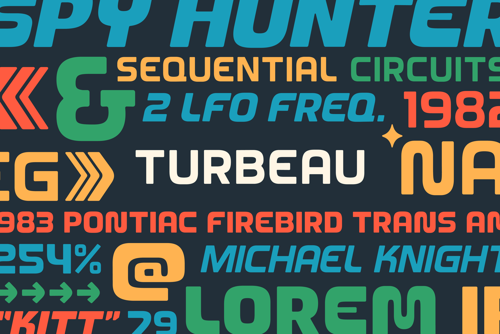
Today, our latest typeface, Turbeau, is released! It's inspired by the end credits of Knight Rider and analog synth controls.
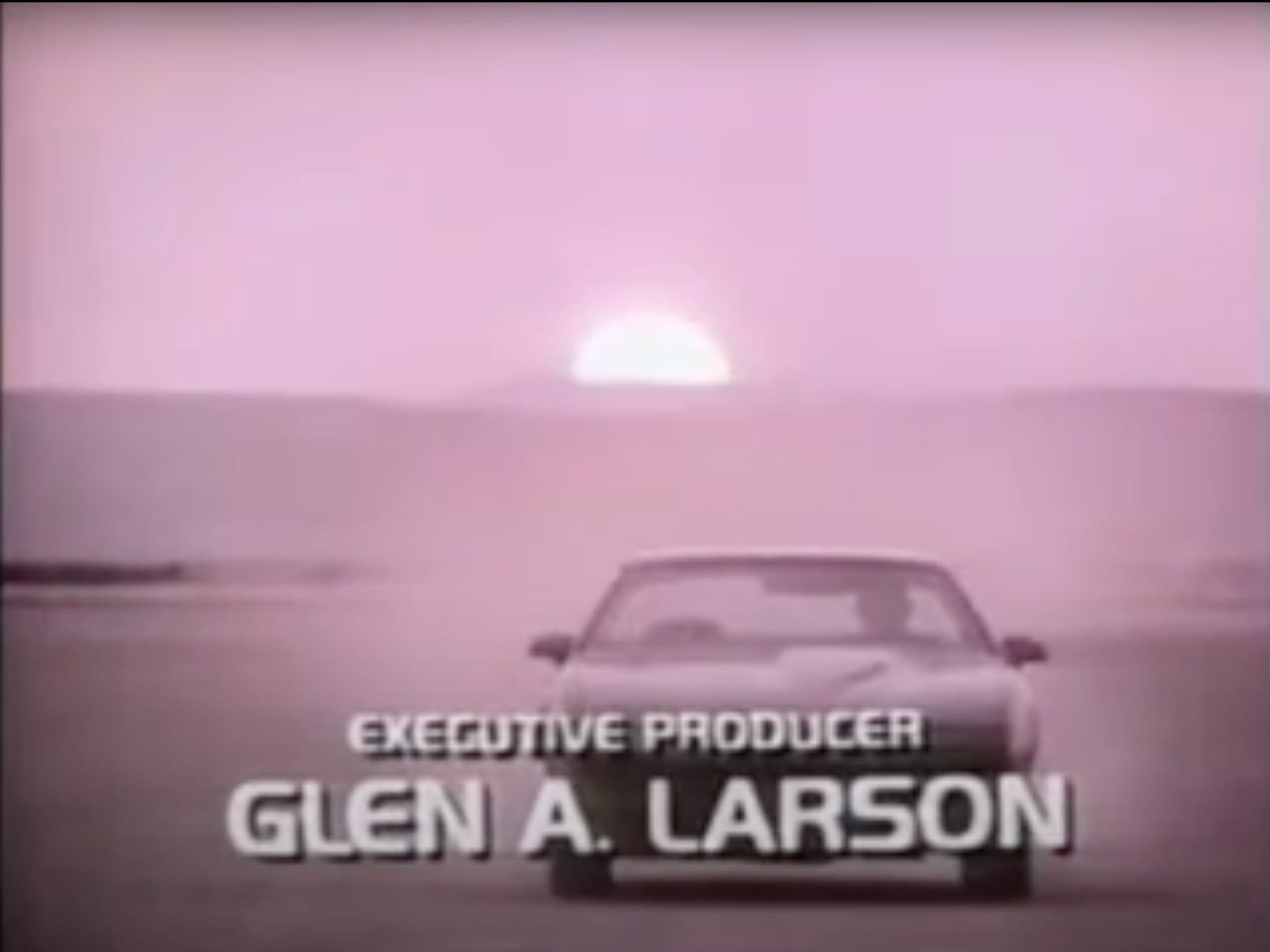
Years ago, I remember flipping through cable channels and nostalgically catching the end of an episode of Knight Rider. I loved this show as a kid growing up in the 80s. I mean, what kid wouldn't love a show about an indestructible, talking Trans Am?
Anyhow, the end credits started rolling, with Michael Knight's 1982 Pontiac Firebird speeding through the desert at sunset, and the typeface that appeared stopped me in my tracks. It was retro but futuristic, with bendy stems and analog video tape grit. And then it was gone. Only the first credit for the Executive Producer was set in this glorious font. It was all the inspiration I needed to create something Michael and KITT would feel at home with. Letters that are akin to that credit—but with my own spin on something friendly-but-utilitarian and nostalgic-yet-science-ish.
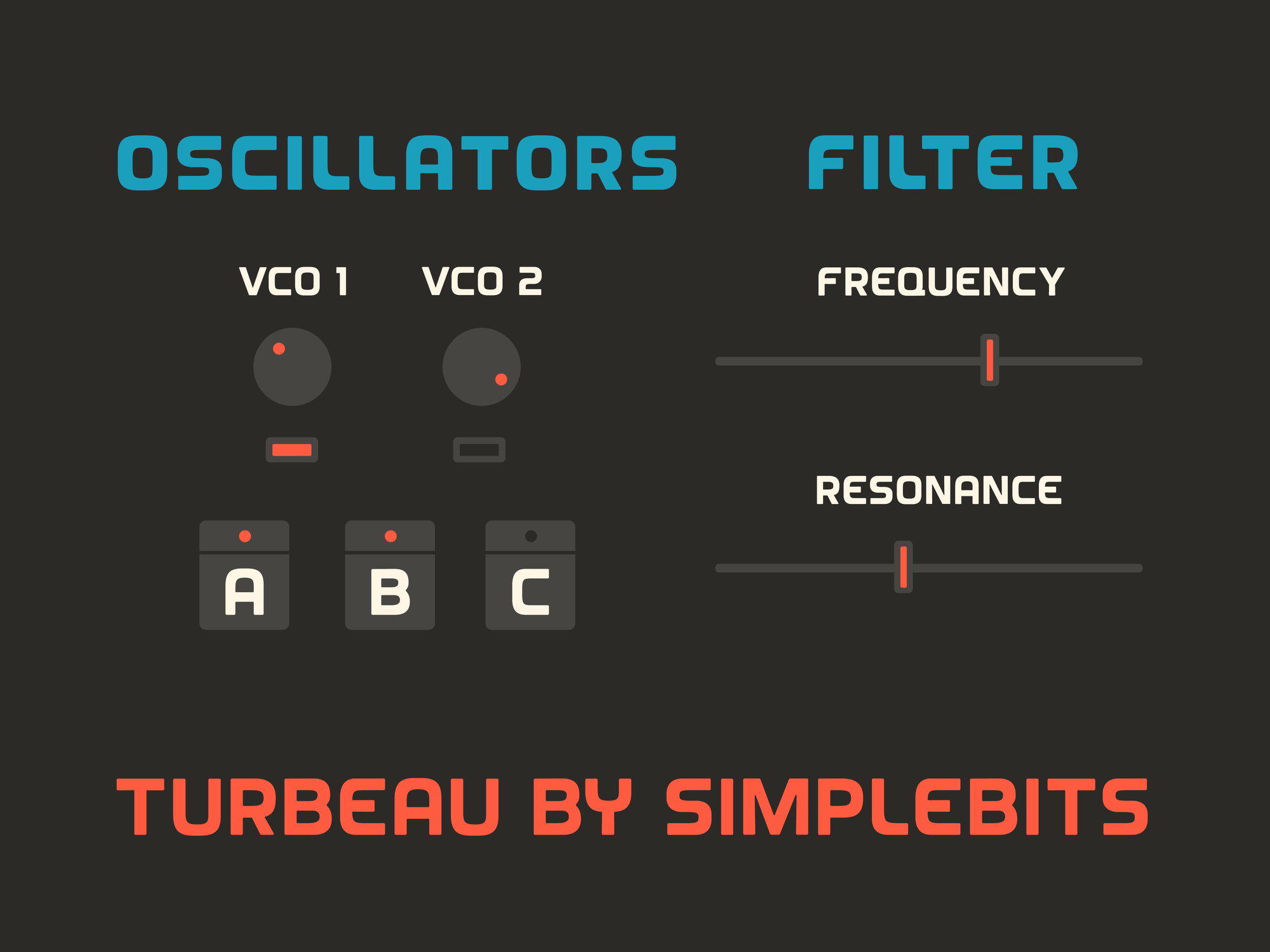
As I was developing the new fonts, it occurred to me that the type is very similar to the control panels of my beloved Sequential OB-6 analog synth. That fueled further inspiration and a resolve to see this one through. I added 3 weights, with the contrast increasing as the type gets heavier. This gives Semibold and Bold even more personality, while Regular remains a bit more even-keeled and conservative.
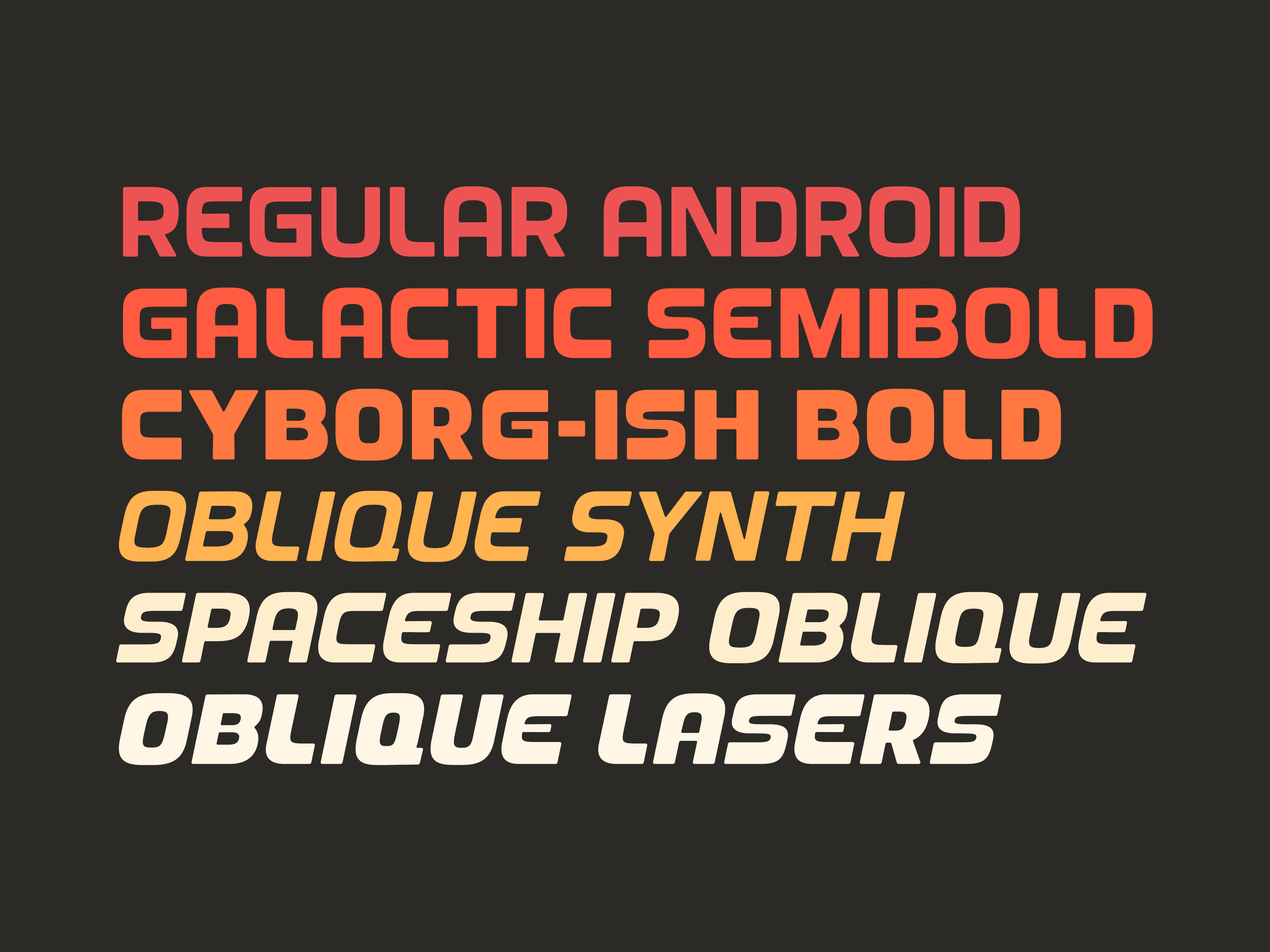
You can't do a retro-futuristic typeface fueled by fast cars and analog warble-ness without making them oblique as well. Each of the 3 weights also has a corresponding oblique style.
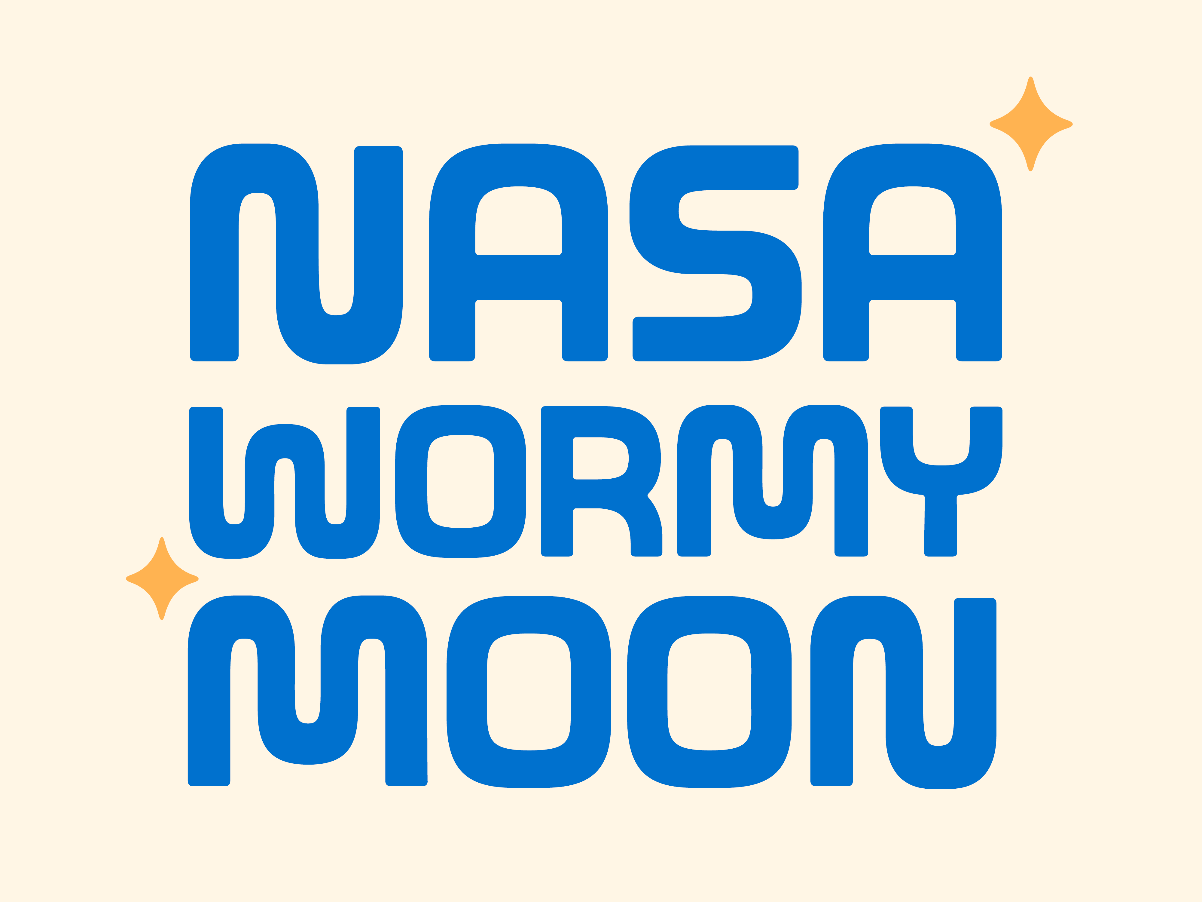
I also added some worm-y alternates for letters like N, M, W, Y, etc. — and an alternate apostrophe that doubles as a twinkling star icon that aligns to some of the letters curves. There's also extensive support for additional languages via diacritics and extra glyphs.
I hope you dig the new typeface and make fun new things with it! Oh, and you can unlock Turbeau for free by becoming a Gold subscriber ✌️✨.