Introducing Scorekard
Our latest typeface, Scorekard, is released today! It's an imperfect sans-serif inspired by the lettering on a vintage, paper, baseball scoring card.

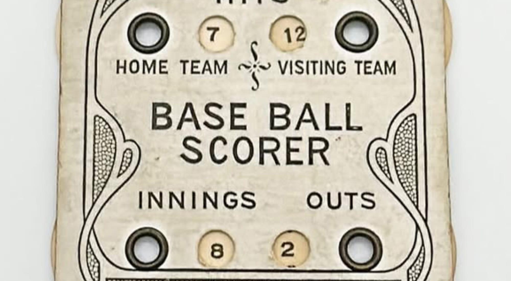
About a year ago, I left a comment on dailydennison's photo of an old "Base Ball Scorer" photo they posted. “This should be a font!”, I said. And now here we are.
I've long been a fan of dailydennison's Instagram, where they share nothing but vintage artifacts that were made by the Dennison Manufacturing Company in Framingham, Massachusetts. The company was founded in 1844 and merged with Avery in 1990.
In their heyday, they specialized in making unique boxes, tags and labels, crepe paper, and holiday-themed paper products. The type inspiration from this stuff is rather endless, and this paper scoring device's lettering stopped me in my tracks long enough to make good on my comment last year.
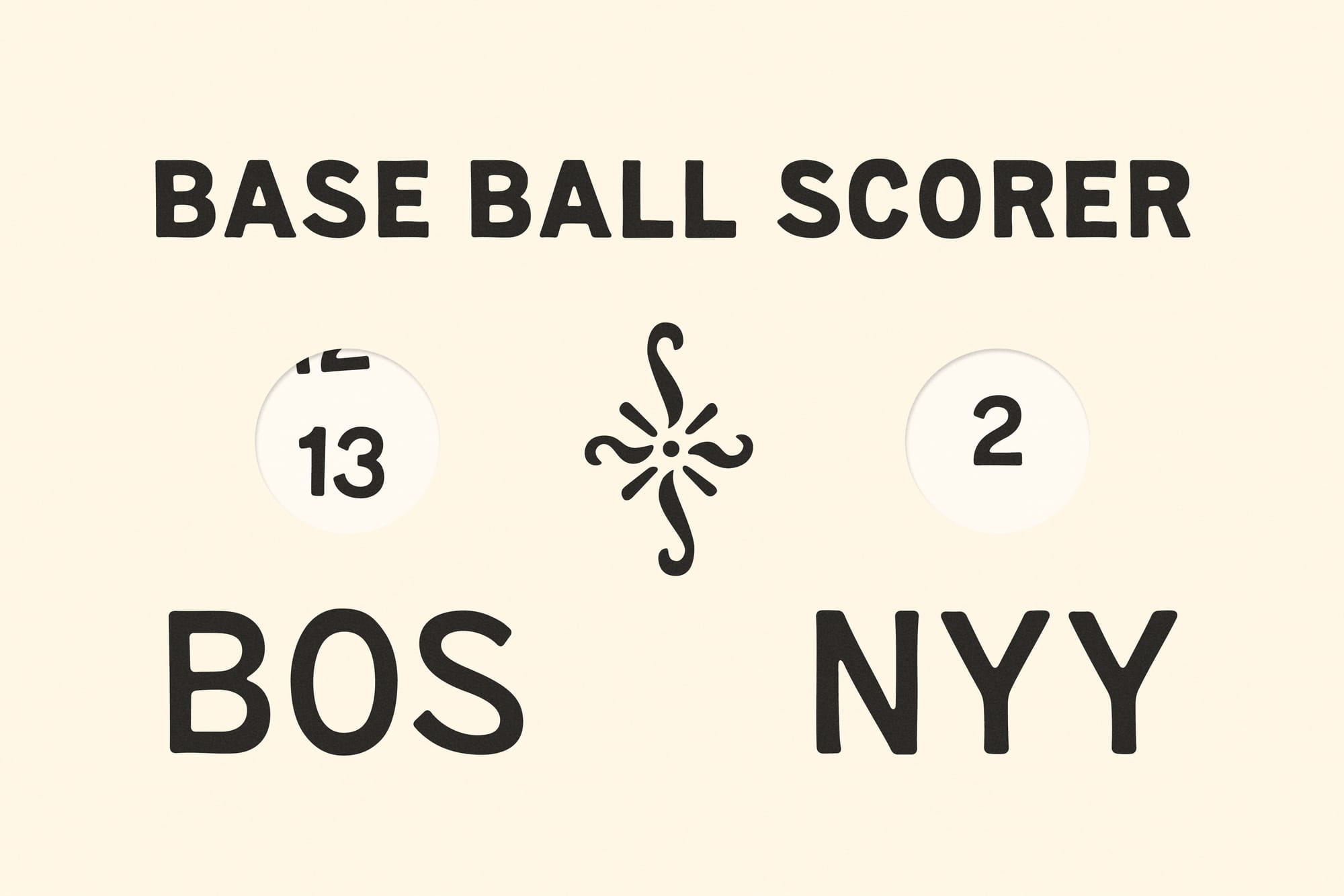
How it started, how it's going.
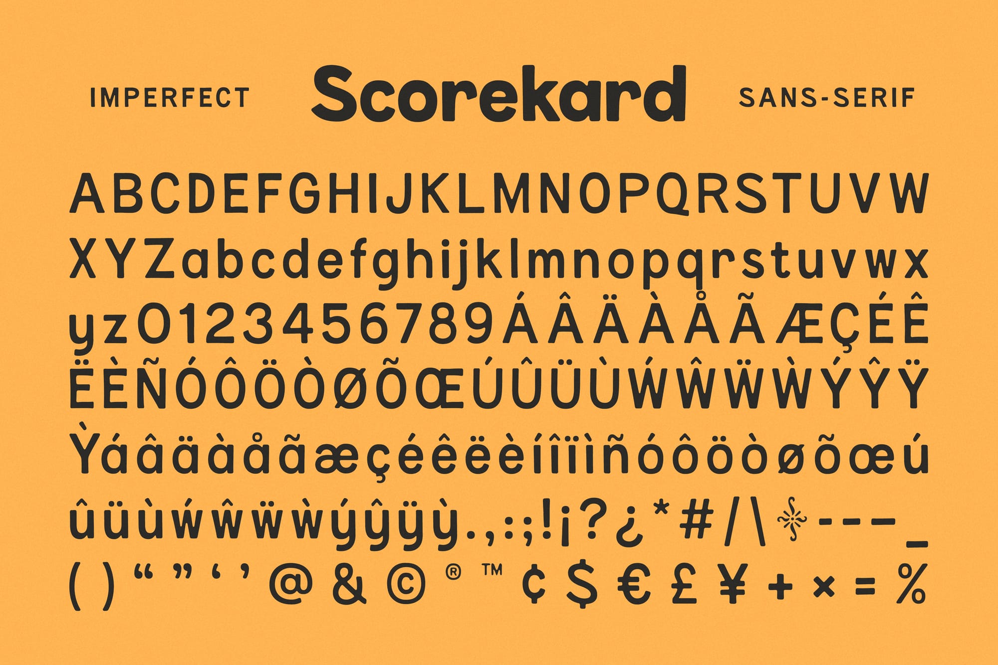
What really stood out to me was that capital 'S'. It looks alive with character! Like a cartoon cobra ready to strike. But in a friendly way, of course. So, like other typefaces around here, it starts with a handful of letters and quickly balloons into an all-caps alphabet, numbers, punctuation, etc.
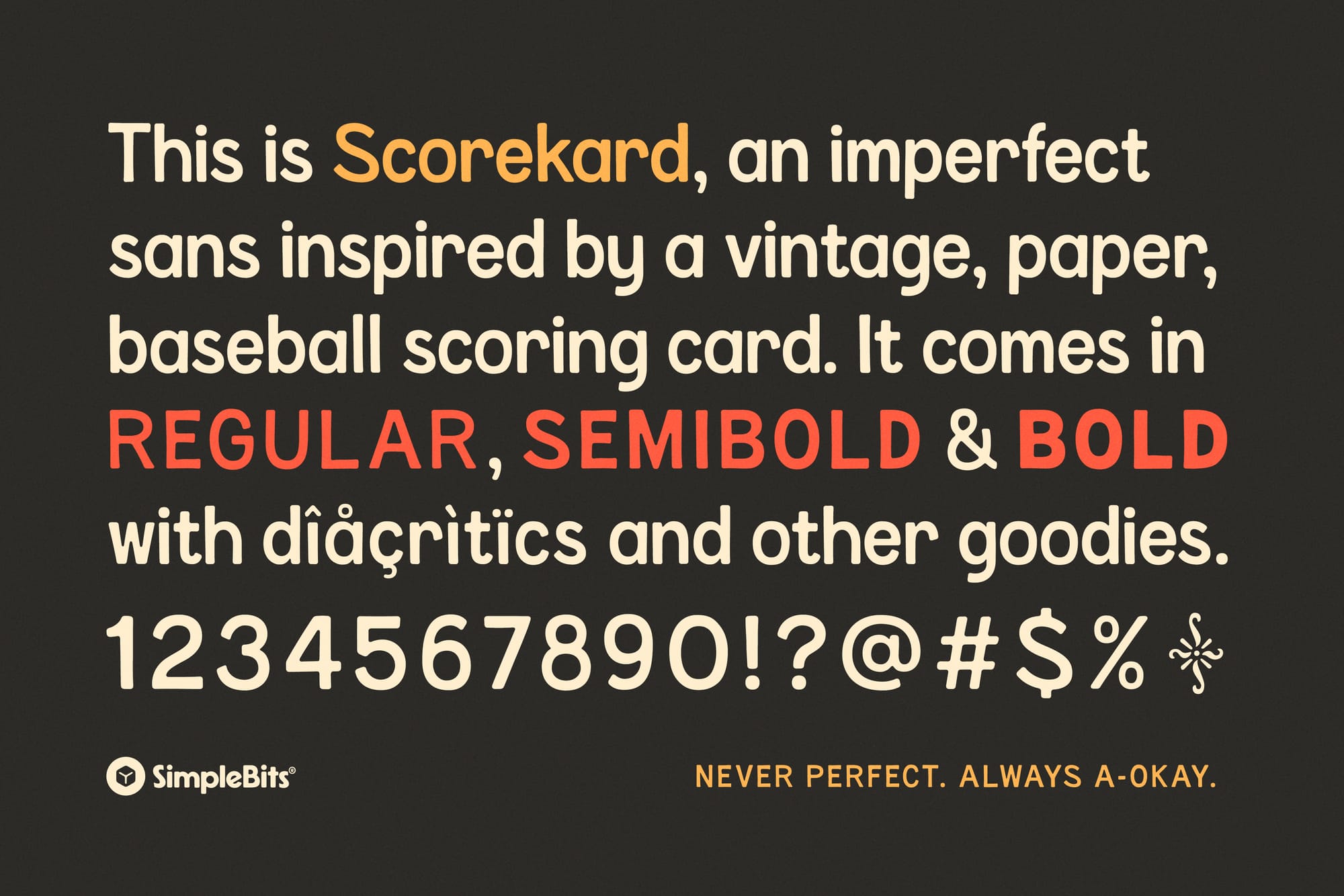
This time it felt right to interpret those original Dennison letters into a full lowercase alphabet as well—and in three weights: Regular, Semibold, and Bold. I also added some decent Latin language support by way of diacritics and some other glyphs. Notably, recreating the swashy ornament found on the original card as an alternate character for the asterisk.
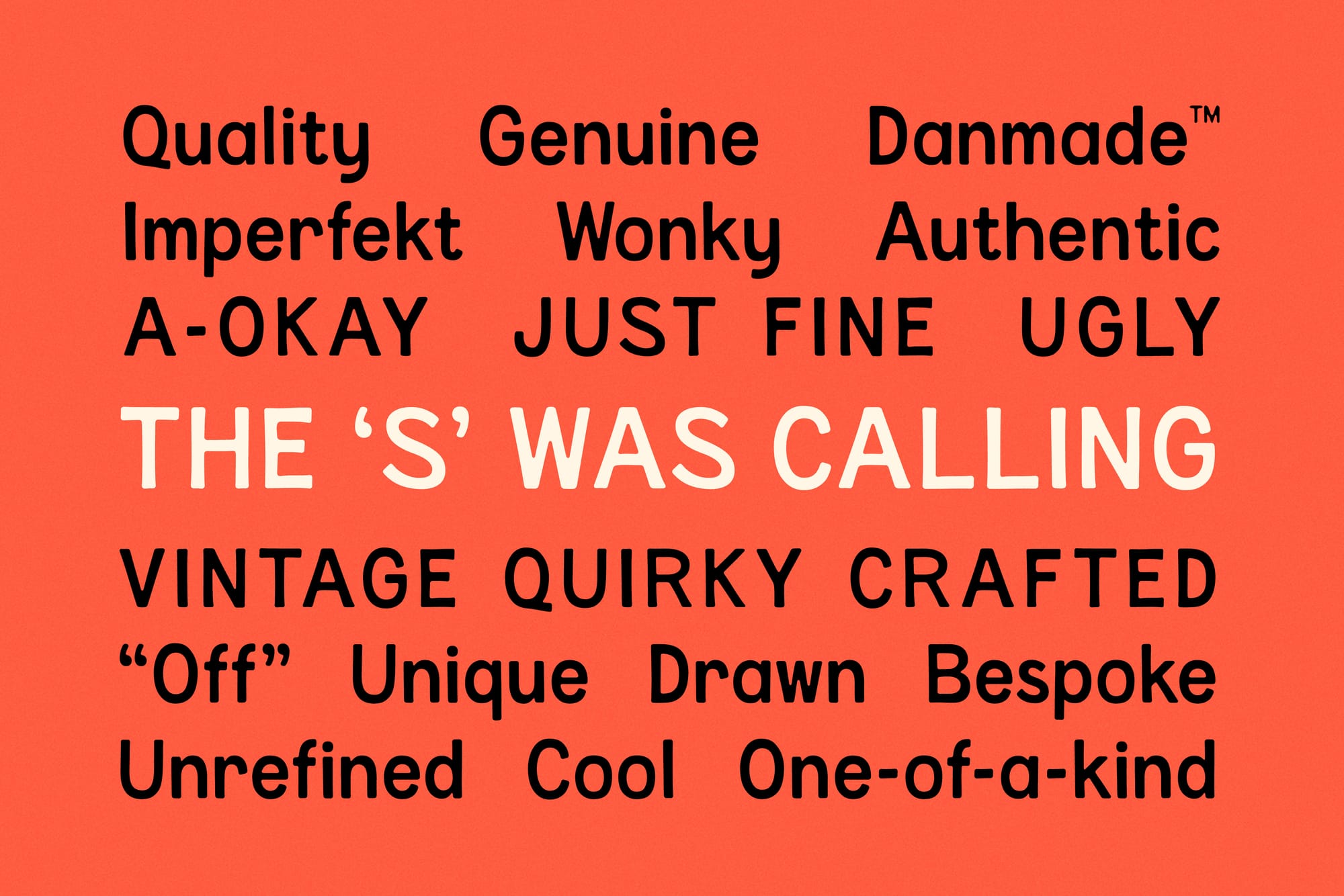
Scorekard is intentionally quirky, with handmade line wandering and friendly, inky, roundness. It's got character—but not too much that would limit its useful-ness. Scorekard is a display sans that'll work hard for you.
I hope you dig the new typeface! Oh, and you can unlock Scorekard for free by becoming a Gold subscriber ✌️✨.