Studio Notes #85
Hello, Friends! Here are this week’s Studio Notes™—quick bits delivered to you each Friday.
🧢
This week I came across Lost & Foundry, a cool shop that sews vintage patches on new hats. They'll even make you a custom combo from their giant patch library. Lots of classic car stuff here, but also other vintage brands. This wins the Upcycle of the Year prize.
🍕
Speaking of pizza, this one is for the Gen Xers. Have you been to a Pizza Hut Classic? A select number of the restaurants refashioned to their peak 80s-era with the red and white checker tables, red plastic cups, Tiffany lamps, salad bar, etc. It was a vibe worth recreating. Pizza Hut is one of those brands who smartly went nostalgic with their logo after ruining it in the 90s and 00s. Burger King is another one that comes to mind that completely nailed the return to an original brand with a fresh take. If only we could get Dairy Queen to do the same (weigh in below on This Week’s Poll).
🎤
Teenage Engineering designs some extremely beautiful audio products. I don't have a real use for it, but recently saw a video of someone touting their TP-7 Field Recorder as an insanely cool “iPod”. Likely overkill and excessive—but surely a conversation starter when you whip this thing out waiting for your coffee order and start scratching your tunes with the big physical dial.
🎢
To celebrate the opening of the Rock n’ Roller Coaster Starring the Muppets, Dr. Teeth & the Electric Mayhem played a 20-minute concert live at the Disney World ride. They even closed with my favorite EM tune, Can You Picture That?. I don't enjoy roller coasters at all, but may have to get over that to ride this particular one. Damn.
This Week’s Poll
Which brand should lean back into their previous logo?
Last week, I asked about your favorite music format and for awhile I was surprised to see the CD winning—but in the end vinyl took the win. Glad to see the under appreciated MiniDisc getting a respectable 16%!
What are you working on?
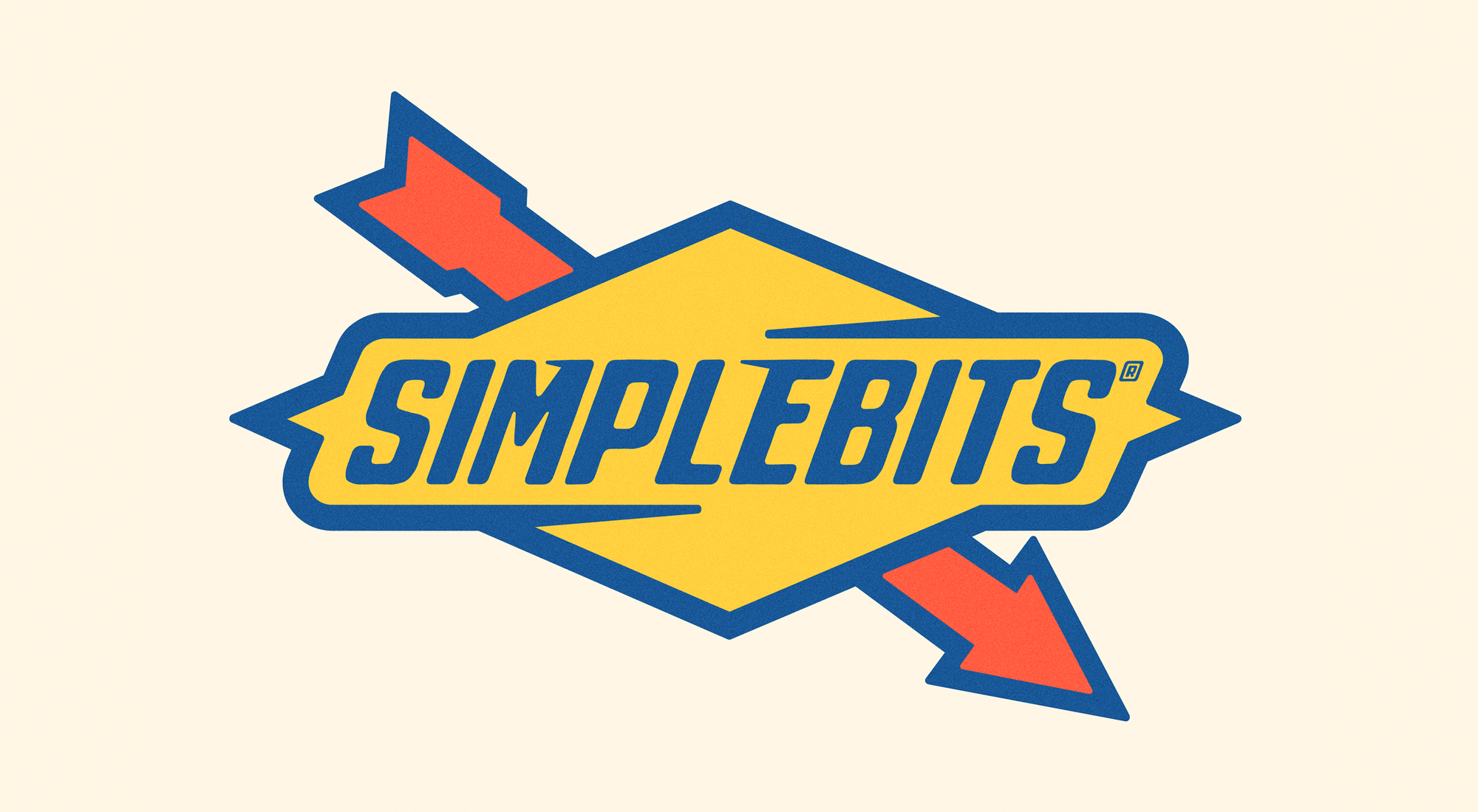
For no reason, I made another logo mashup from the infamous Sunoco gas station sign. Maybe it's a subliminal, anti-war, gas-price-hike statement, or perhaps it's far less meaningful and simply an excuse to create something that doesn't need to make much sense. Creating for creating's sake. Which, gives a tiny sense of control in a time where so much of it feels chaotic and frustrating.
Get Studio Notes™ delivered to you each Friday.
I think that nicely sums up why I gravitated toward type design of all things these days. Solving these little, manageable “puzzles” that designing each glyph of a typeface presents.
A temporary purpose.
The solutions aren't going to change the world—but they at least make it more bearable.
Cheers,
