Studio Notes #83
Hello, Very Fine People. Here are this week’s Studio Notes™—quick bits delivered to you each Friday. I'm writing today from Chicago, where I was chair for the Society of Typographic Arts STA 100 competition. Shout out to judges Lauren Hom, Lisa McCormick, Damian Orellana, and Simon Walker. If you're not following them already, their work is outstanding and they are top notch folks.
💧
This is rather genius. A die-cut sticker label on a bottle of water that, when unpeeled, instantly makes a carrying strap. This kind of innovation should be on all beverage bottles for hands-free hydration portability. I'm going to assume it's patented. And boy is it a cool idea.
🖼️
They're too expensive right now, but I love seeing color ePaper tech getting better and better. Buy a frame once, have unlimited art choices. Also, this one's battery lasts an entire year on one charge. Insane. It does bring up print licensing worries though. If there's a digital version hi-res enough to display out there hanging around, how does the artist get properly compensated? I hope more intelligent folks than I are already thinking about this.
🚂
If I ever get to visit Hamburg, Germany, I'll be making a beeline directly to Miniatur Wunderland. It's the world's largest model railway, recreating various cities and scenes from all over the world. But more than just trains! Their latest installation features the famous Formula 1 track in Monaco, with a working "magnetic field" roadway with working race cars. This place looks massive, and they recommend at least 3 hours to take it all in.
🚣
A new show I've been enjoying: Widow’s Bay. Maybe I'm drawn to the coastal New England setting (it was filmed up the road here) or maybe it's Matthew Rhys' performance, or the fact that it is both genuinely hilarious and convincingly frightening. The show, so far, has successfully genre-blended better than anything else in recent memory. The homages to nostalgic stuff like Stephen King, The Goonies, Jaws, etc. doesn't hurt. I'm hoping it remains this good through till the end.
This Week’s Poll
I tried another deep dish while in Chicago: Pizano's. It was better than Lou Malnadi's but not as good as Giordano's in my honest opinion. I'm sure there are others. But it got me thinking...maybe I don't love deep dish, in general. And maybe most Chicagoans don't either? That brings me to this week's poll question...
Where is the best pizza?
Last week I asked what the best city is for type and design, and the results were pretty evenly spread out amongst my limited, random pool of choices. Tokyo taking a narrow lead over Paris! Agreed on Tokyo though. The manhole covers are worth the trip alone.
What are you working on?
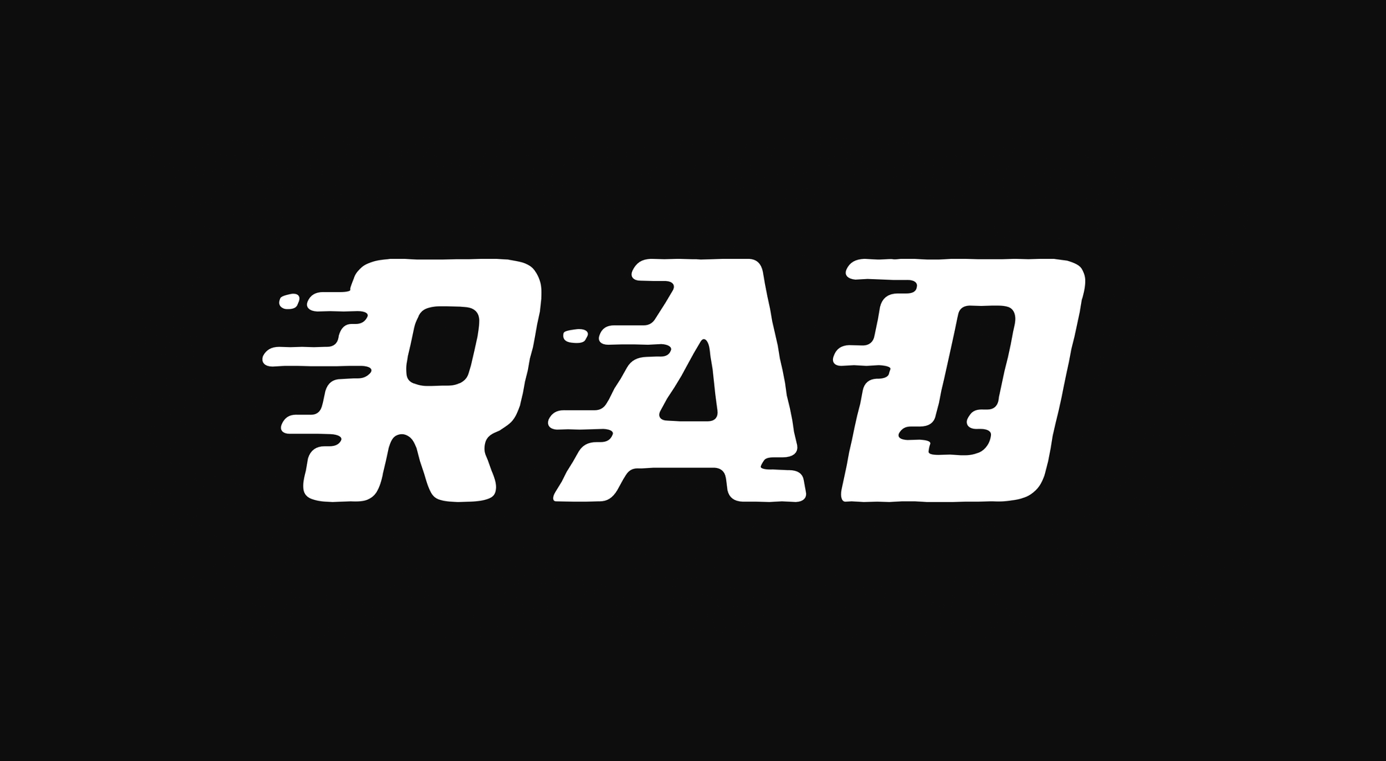
Now that Beeswacks is out, I'm circling back to Racely—a speedy, windburned, slanted variant of Parkly Extra Wide. I might make this one a quick, limited character set font with a price point to match, as it's really specific! I'll continue to share progress, of course.
Get Studio Notes™ delivered to you each Friday.
I hope the Spring here in the Northern Hemisphere is treating you well thus far, and thanks very much for reading!
Cheers,
