
Jul 24, 2023
Free Lunch
I think the first letter I drew for Free Lunch was the C. I wanted one that had a “tight bite” (clearly an actual typographic term). Like it’s really chomping down on itself. I love the attitude it projects. I guess I love chompy Cs.
From that initial C, the rest followed. That’s not how you’re supposed to design a typeface. You’re supposed to start with letters like H, N, and O. But this one started with C, and let’s just blame anything you don’t like about it on that fact.
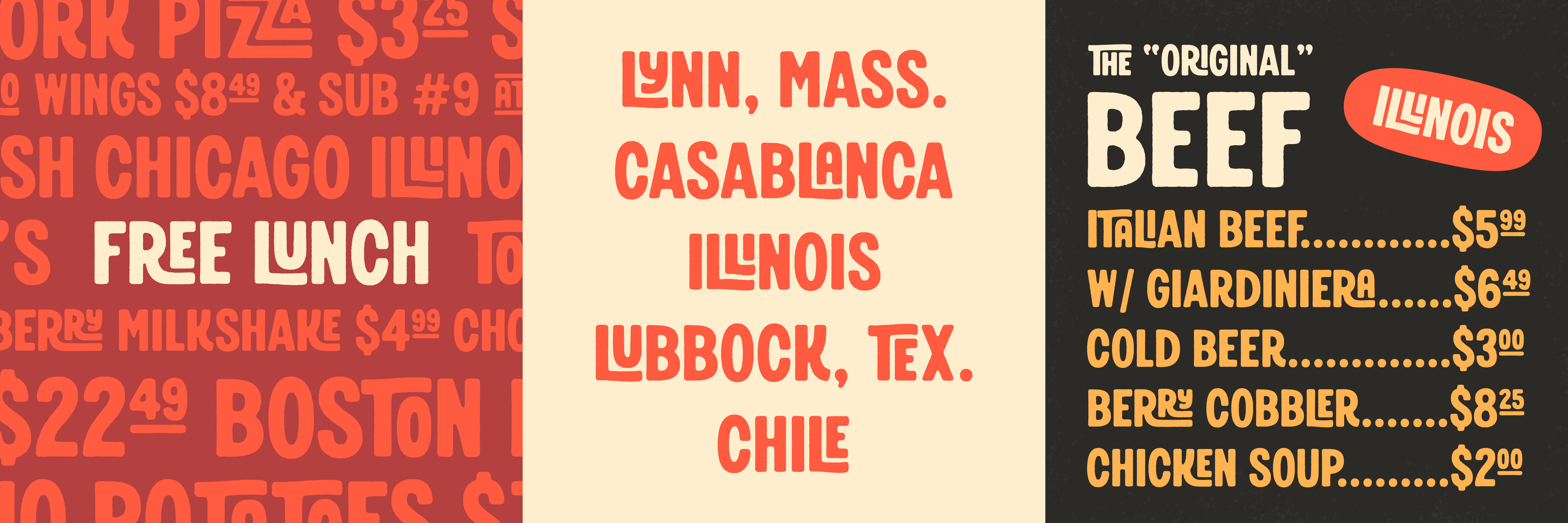
Free Lunch is an all-caps display font that would look comfortable in a butcher shop window. Or a lunch counter menu in 1955. Or printed on the waxed paper that wraps a half-pound of Swiss cheese from your neighborhood deli. A little playful, great for headlines and logos.
Included are two styles: Regular and Rough. A–Z, numerals, basic punctuation, a few alternate glyphs, plus over 40 ligatures for easily adding maximum sign-painting vibes. I can’t wait to see how you use this one.
You can test out and purchase Free Lunch right here.
•