
Jan 11, 2023
Grandsans
I have been a lifelong Red Sox fan, and Fenway Park has always been a special place for me and my family going back generations. We’re even season ticket holders as of last year.
The type around the historic park has always been inspirational. Thick, cream-colored, painted letters on green iron columns and tin signs throughout. All with an early-mid 20th century vibe. There is so much history at Fenway, which was built back in 1912.
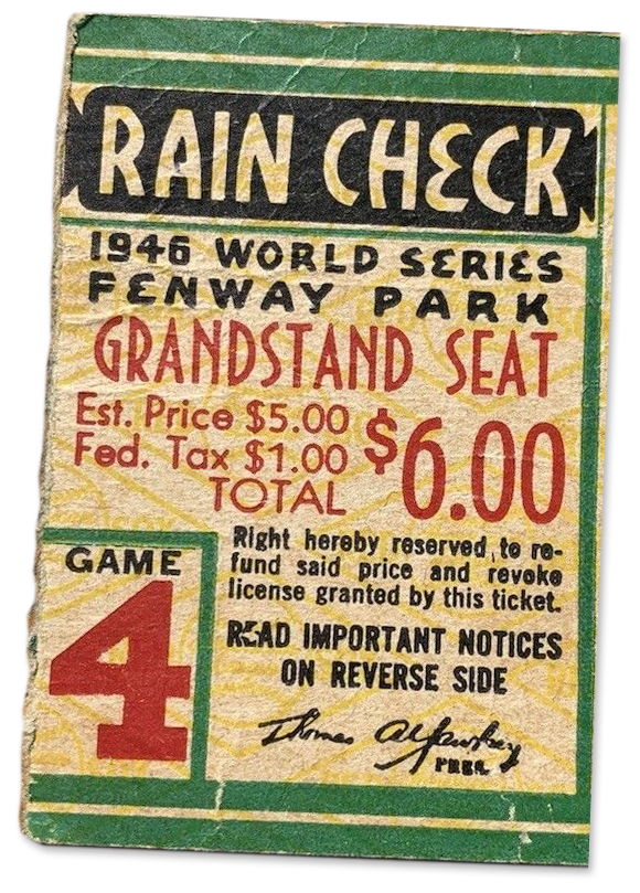
Last year, I came across this old ticket stub and was immediately struck by the hand-drawn lettering. The curves in letters like E and H and the movement that letters like M and N in “1946 WORLD SERIES” create felt so unique and worthy of becoming a typeface.
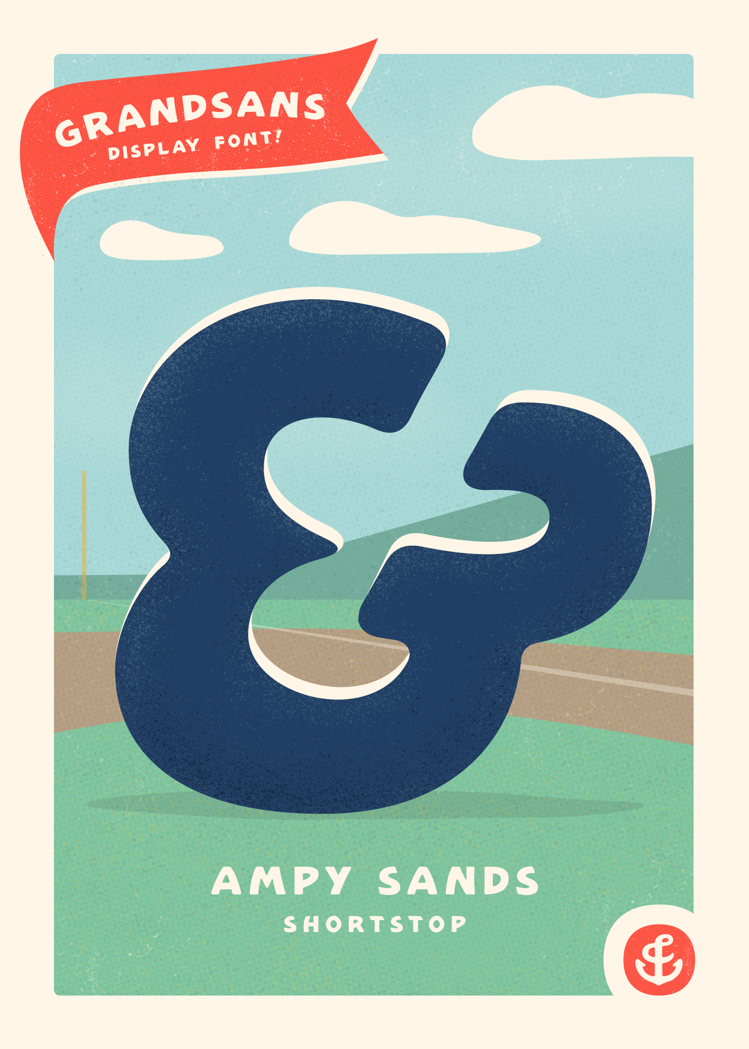
So, I set out to create a new font based on those handful of letters from the ticket. And yesterday, we released Grandsans—an all-caps display font with those sign painting qualities and vintage vibes. It comes in two styles: Regular and Rough.
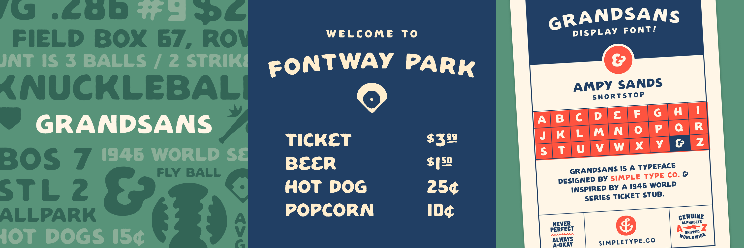
There are also some fun alternates (E, H, Y), discretionary ligatures for prices (.00, .50, .99, etc.) and also some vintage-y baseball-related icons thrown in (baseball, homeplate, diamond, bat, etc.).
Oh, and there’s an alternate backward “K” when you’re box-scoring those “struck out swinging” plays. We even made a limited edition baseball card to show the font in use. We gave away 50 of these yesterday and will probably do that again soon.
Fun fact: 1946 was the only time the legendary Ted Williams played in a World Series. Unfortunately it didn’t go very well for him (or the Red Sox). The Sox lost to the St. Louis Cardinals in 7 games. They wouldn’t win a World Series for another 58 years.
You can test out and purchase Grandsans right here.
•