Studio Notes #58
Greetings, Design Pals. Here's issue #58 of Studio Notes™—quick bits delivered to you each Friday.
🗡️
Artist Julien Curi is making another animated film called Knight and the Snail made entirely out of paper. His stop-motion work is mind-bogglingly detailed and incredible, and you can contribute to the project and get your name in the credits when the new film is released.
📚
I have a few other Standards Manual books and they never disappoint for inspiration. They've just announced a new Compact Edition of Identity: Chermayeff & Geismar & Haviv covering the legendary design firm founded in 1957. C&G&H is behind so many iconic brands like Chase Bank, NBC, Mobil, Pan Am, and hot damn that PBS logo. Not to mention omnipresent identities for local Boston institutions like WGBH, JFK Library, and the T. Their body of work is dense. Looking forward to learning more about their process in this book.
📖
Speaking of books, I went to a great talk by paper design wizard, Kelli Anderson, about her new incredible pop-up book, Alphabet In Motion. It's a bewildering book for anyone—especially typography aficionados. Behind the impressive paper engineering are essays about each letter, covering the history of type design and the letters themselves. A fantastic resource and well of inspiration for any designer.
📻
I actually enjoy SiriusXM. Even in an era where your phone can play anything you'd like at any moment, in the car I prefer to let someone else decide what I'm listening to most of the time. Maybe growing up with terrestrial radio has something to do with that. Anyway, I occasionally hear new artists this way on XMU and their Discovery channel. The latest? A band called Peel Dream Magazine, whose latest outtakes collection, Taurus, and last year's album, Rose Main Reading Room remind me of a combination of Belle & Sebastian combined with Eric Matthews' whispered vocals. I'm digging the sparse pop production and vocal-less choruses. It's pretty chill for working to as well.
• • •
• • •
What are you working on?
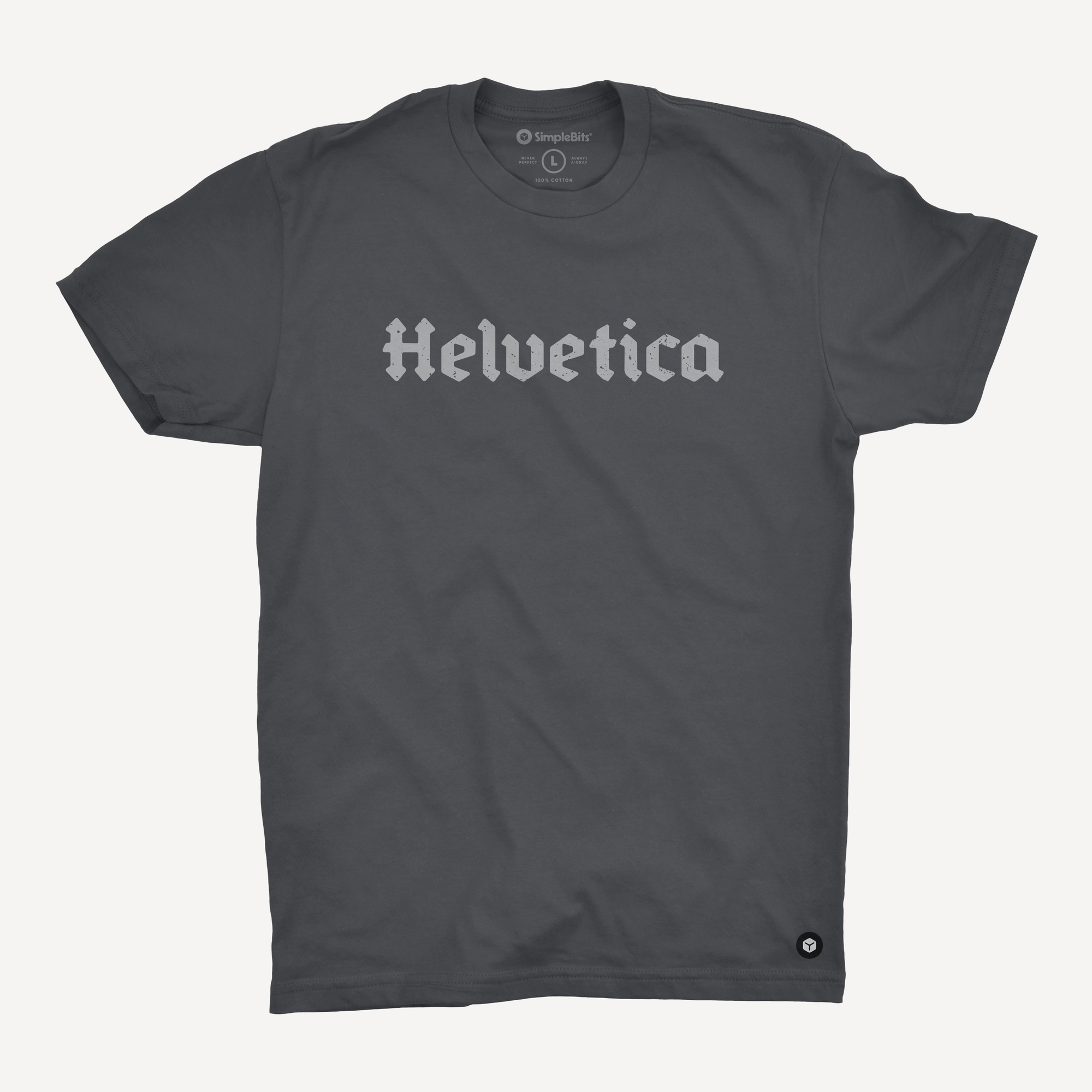
New in the shop! The Helvetica Tee. We chose a random, made-up word to feature our modern blackletter typeface, Dragönsteel. We love the way the word sounds and how it fits in with the rugged, medieval lettering. Anyway, this comfy t-shirt may generate looks and questions from the public. Distressed, light gray ink on a garment-dyed, almost-black, 100% cotton shirt. Embroidered logo badge on the left hem.
Get Studio Notes™ delivered to you each Friday.
I hope you have a great weekend, and we'll see you back here next Friday.
Cheers,
