Studio Notes #40
Hello, Wonderful People. Here's issue #40 of Studio Notes™—quick bits delivered to you each Friday.
📔
The story of How Field Notes went from side project to cult notebook is a great one: Make something you want to see in the world, do it with passion and care, and others will follow. I've always been inspired by the community FN has created around it. It's paper notebooks—but Aaron Draplin and Jim Coudal tapped into a sweet spot of creative collectors with these little things. Pretty sure I have some rarities in the archives from early event collabs.
📻
Analog cassettes making a comeback? Maxell is releasing a new cassette player with Bluetooth and USB. I love vinyl for its sound and artwork and its resurgence makes a lot of sense. Cassettes have their own pros and cons. I remember putting scotch tape across the tab holes of a Chaka Khan cassette so I could record over it with imperfectly-timed radio plays of horribly-great 80s pop metal tracks. I'm not sure if that nostalgia translates to the current generation, but perhaps the idea of the mixtape will resurface.
📚
It was a no-brainer to back India Street Lettering, "a 200-page hardcover full-colour book by Pooja Saxena showcasing striking public lettering from the country — in paint, in relief, in mosaic, in neon, in wood, you name it. Spanning over a dozen cities and scripts". Happy to see it's been fully-funded and looking forward to this one!
🕰️
Mel bought us tickets to Back to the Future The Musical for Christmas, and we went to opening night here in Boston this week. It's fitting, as this summer is the 40th anniversary of the movie. I was 11 when BTTF was released and watched it in the theater 6 times. I bought the "Marty" jean jacket, skateboard, etc. Obsessed with it all. The musical was fantastic and a lot of fun. They nailed the costumes and props, particularly the Delorean and clock tower sequences, with some animatronic + dual projection screen magic to make it all work on stage. I was also glad that many of the films iconic lines were preserved, and even exaggerated for comic effect.
What are you working on?
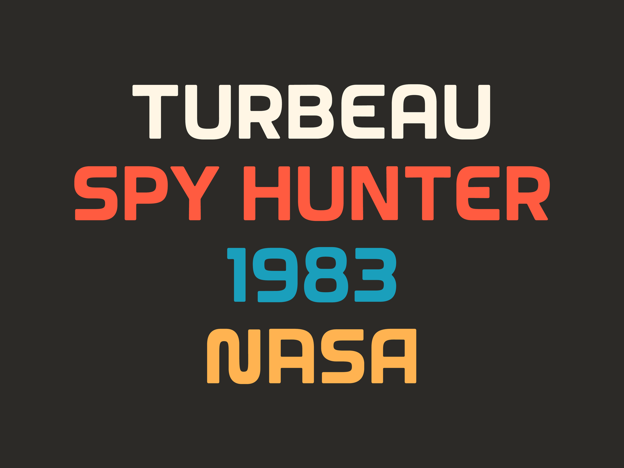
For a long time I've wanted to make a font inspired by the end credits of Knight Rider, and a few weeks ago I finally dove in. Very early WIP here roughing out A–Z and numerals, but I'm digging where it's landing. Working title is Turbeau.
Thanks for reading! I really appreciate you.
Cheers,
